- Use when the input requires the user to select a specific date.
- Date picker should be triggered by or used in conjunction with another component, such as a text input or chip.
Date Picker
A date picker is an interactive element that allows users to select a date or range of dates from a graphical calendar interface.
Dos and Don'ts
- Don't use a date picker if the user already knows or is very familiar with the date, e.g. date of birth.
Anatomy
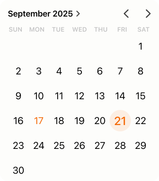
Graphical
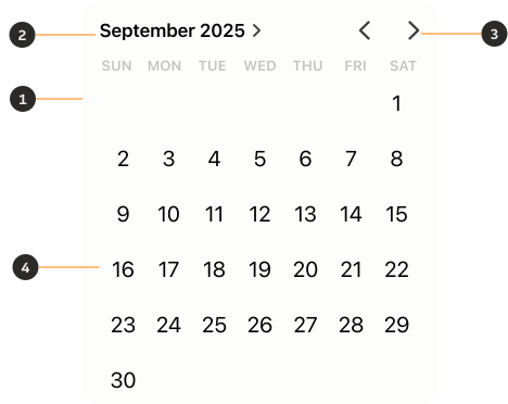
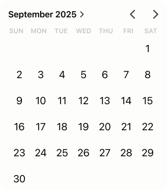
- Container: Background container that organises the information.
- Current date: Informs the user of the action.
- Icon button: Allows the user to move forwards or backwards through a set of content.
- Content: Displays selectable dates, months and years.
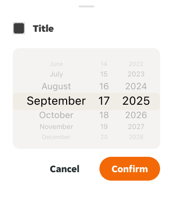
Wheel
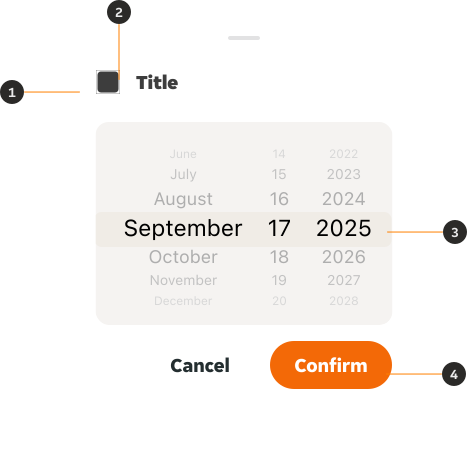
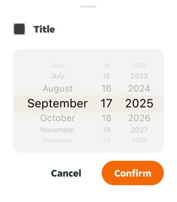
- Bottom sheet: Modal that organises and contains the information.
- Title: Header used to add contextual information.
- Content: Displays selectable dates, months and years.
- Button: Allows the user to confirm their selection.
Variants
Graphical
Use when users need to see a range of dates, days of the week and availability at a glance.
Wheel
Use for quick date selection when users know the exact date they need to select.
Modifiers
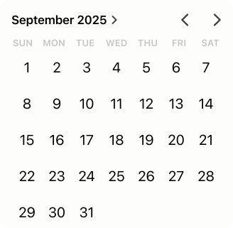
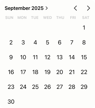
Week
The structure of the content can be customised based on the amount of weeks needed to display for the month.
Day
The day nested instance can be customised based on the status.


Interactive states
Outlines the atomic level interactive elements for the nested day instance.
Day selector
The day nested instance can be customised based on the status.


Examples
LTR examples
Here are some examples of the components in left-to-right context.
RTL examples
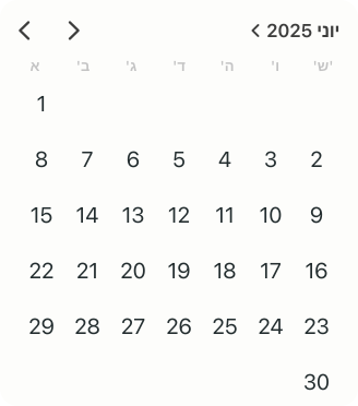
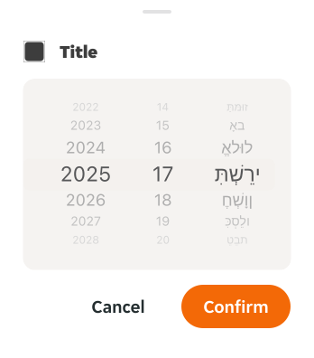
Here are some examples of the components in right-to-left context.