- To organise and display data.
- Use when your user must navigate to a specific piece of data to complete a task.
Data Table
Data tables organise and present data in a structured manner, enabling users to easily view, sort, filter, and analyse information.
Overview
Anatomy
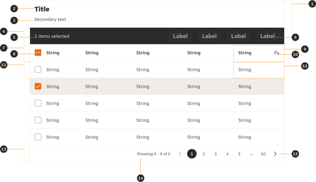
- Header (Optional): Section that contains the title and secondary text.
- Title: Gives the users an overview of the content.
- Secondary text (Optional): Provides additional detail if required.
- Bulk action bar (Optional): Allows users to take action against table rows once at least one has been selected.
- Selected rows: Displays the number of rows the user has selected.
- Action: A single, or collection of Buttons that allow the user to take action against table rows.
- Column headers: Gives users an overview of the column's data along with sort options.
- Checkbox: Allows the user to select / deselect all rows.
- Column header cell: Identifies the category of content within the column below.
- Sort indicator: Allows the user to sort the column via both ascending and descending.
- Row: Horizontal group of values, containing values for multiple fields defined by columns.
- Row cell: Contains information relating to both its row and column headings it sits under.
- Footer (Optional): Section that contains the result display and pagination.
- Result display (Optional): Indicates the number of results, and how many the user is currently viewing.
- Pagination: Allows the user to navigate data across pages when the quantity is too large to be shown at once.
Variants
Default
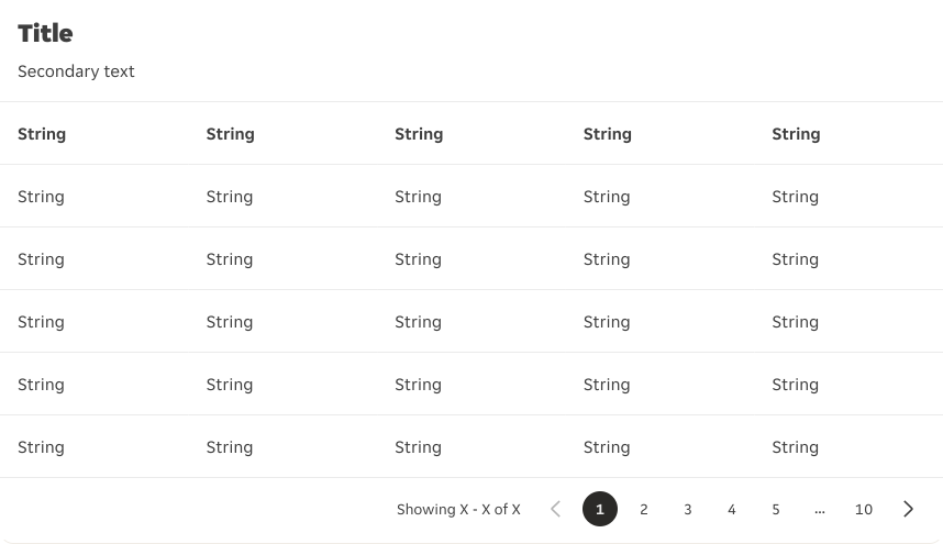
Base style with only the header, rows and footer available.
With selection
Includes checkboxes in the first column, enabling users to select one or more rows.
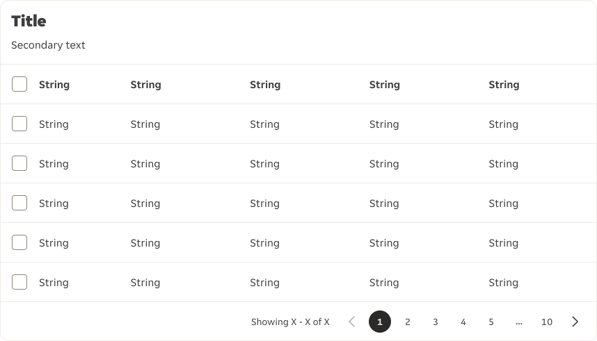
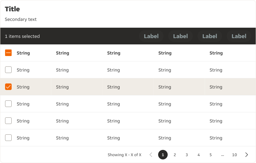
With bulk action
Enables the user to select one or more rows and apply an action (the key is that the actions can be taken in bulk if needed), through the row level checkboxes in the first column.
Modifiers
Column header
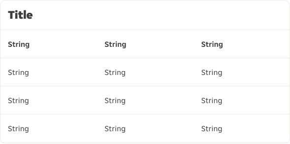
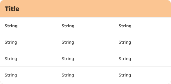
The column header by default uses $container-default. An option for a strong header is available using $support-brand-02. The strong header is used where a page requires visual interest. Only one column header type can be used per page.
Content
Title and Secondary text
- The table's title should make it clear to the user what the table's content is and what purpose it serves.
- The secondary text can be added under the title to provide more information about the data.
Column headers
- Column titles should stick to one or two words that describe the data in that column.
- Column titles should use sentence-case capitalisation.
- If the last column of the table contains actions, the column header will be empty.
Cells
- If any cell is missing content, a
-is used as a placeholder so there are no empty cells.
Cell types
Default
Standard cell type for displaying data.
With checkbox
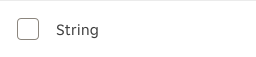
Only available within the first column of the table to allow users to select one or more rows. When used, the first column header also has to include a Checkbox for the 'select all' functionality.
Link
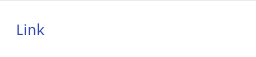
Link that allows the user to navigate to a different page within the application or an entirely different site. It can also be used to display phone numbers or email addresses.
Tag
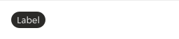
Use when displaying values within a category; such as a status.
With icon
Helps reinforce the data point with an icon that directly relates to the data point.
Button
Available to use within all Data Table variants, but only to be used within the most far right columns of the Data Table to allow the user to take action against a single row. A row level action would be used over the action being located in the bulk action toolbar because the action can only be taken one row at a time, and cannot be actioned in bulk.
Icon button
Available to use within all Data Table variants, but only to be used within the most far right columns of the Data Table to allow the user to take action against a single row. A row level action would be used over the action being located in the bulk action toolbar because the action can only be taken one row at a time, and cannot be actioned in bulk.
Switch
Available to use within all Data Table variants, but only to be used within the most far right columns of the Data Table to allow the user to take action against a single row. A row level action would be used over the action being located in the bulk action toolbar because the action can only be taken one row at a time, and cannot be actioned in bulk.
Overrides
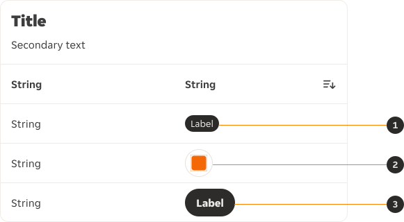
- Tag: The Tag's variants can be overridden.
- Icon button: The Icon button's variants can be overridden.
- Button: The Button's variants can be overridden.
Behaviours
Hover
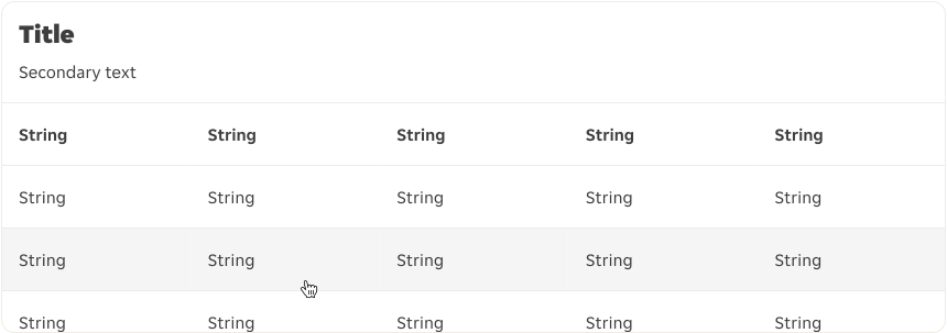
The hover state on a row helps the user visually scan the columns of data in a row even if the row is not interactive.
Pagination
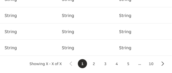
The Pagination component is always placed at the bottom of the data table and indicates the current page, offers previous/next navigation controls, and can optionally display the row quantity. Use Pagination when the table's data exceeds 10 rows per page.
Sort
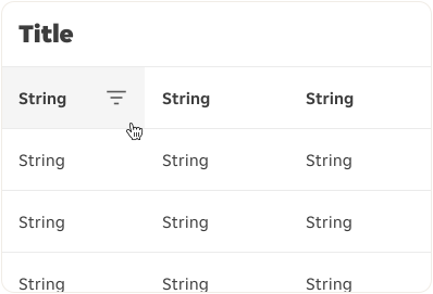
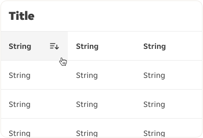
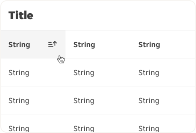
Columns can be sorted in ascending or descending order. Sorting controls are located within the right side of the column header cell, and are represented by a sort icon which appears while hovering over the column header. A column header has three states: unsorted (Sort), ascending (SortAscending) or descending (SortDescending). The icon indicates the current sorting state and is only visible when sorting for a column has been activated. Only the column being sorted should display an icon, and only one column can be sorted at a time.
Select all
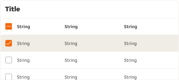
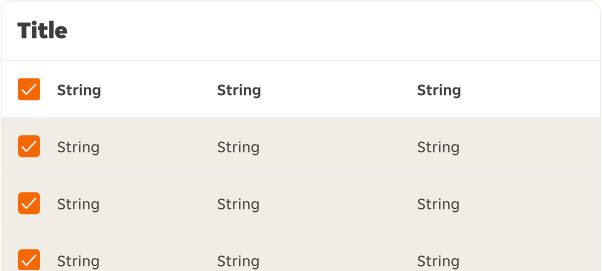
The Checkbox contained within the column header allows users to select all rows (across all pages), as well as deselect any rows that have been selected.
Bulk action toolbar
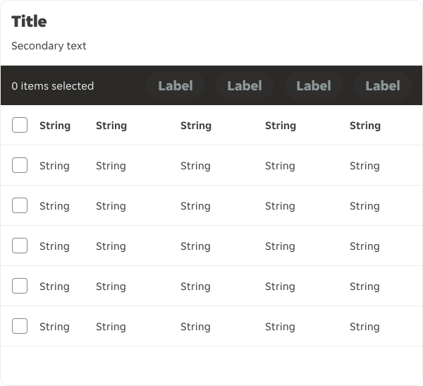
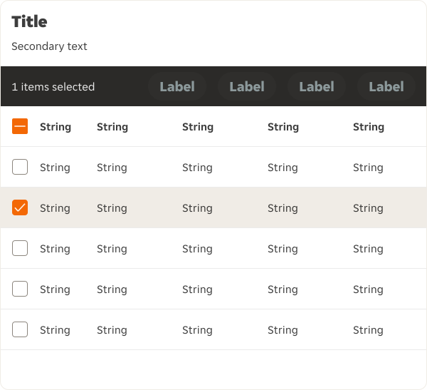
Bulk actions are functions that may be performed on one or more rows within a Data Table. The bulk action toolbar should only include actions that can be performed in bulk. The bulk action bar is always visible so users know they can perform certain actions when selecting one or more rows. Actions are disabled by default until the user selects at least one row. Once that happens, actions in the bulk action bar should change their state to active.
Overflow
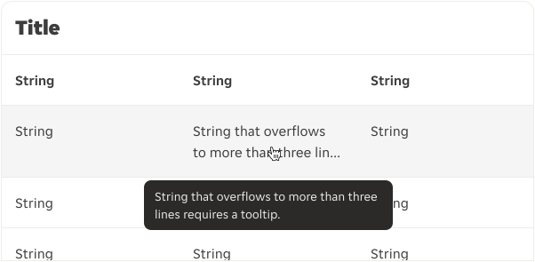
Where Tooltips are required for text overflows, the tooltip — where possible — should display underneath the cell to avoid the Tooltip sitting above the bulk action toolbar.
Column header
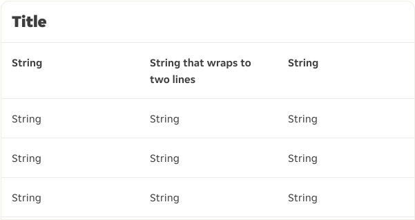
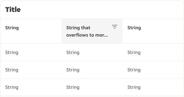
In edge cases where a column title is too long, wrap the text to two lines and then truncate the rest of the text. The full text should be shown in a tooltip on hover of the individual cell.
Cells
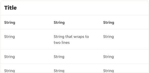
In cases where a string within a cell type is too long, the height of the entire row increases; wrap the text to two lines and then truncate the rest of the text. The full text should be shown in a tooltip on hover of the individual cell.
Data Table
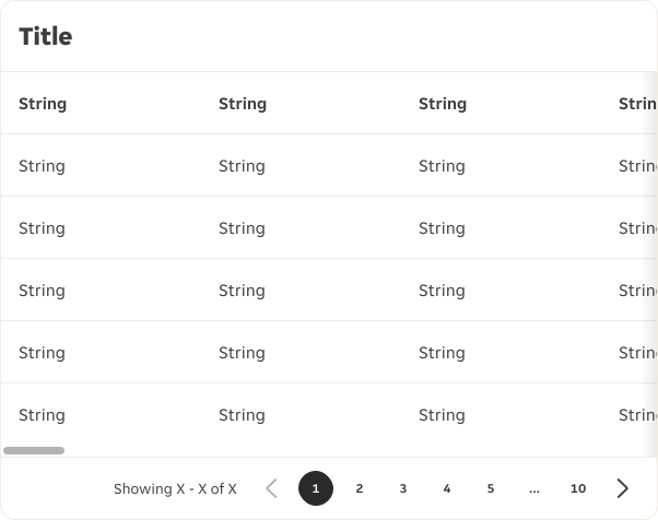
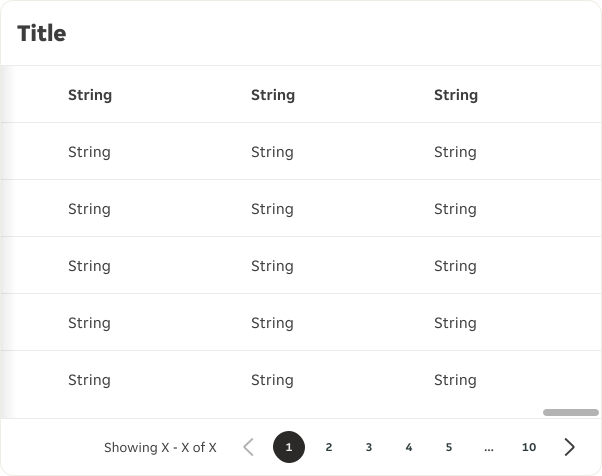
If the amount of content exceeds the horizontal constraints of the Data Table, a gradient indicator is used to inform the user that more content can be accessed via horizontal scrolling. A scrollbar also appears on hover to further reiterate.
Interactions
A Data Table's Checkbox or sort is selected by clicking within the specified touch target area for that element.


- Interaction area in a cell with checkbox.
- Interaction area in a cell with sorting behaviour at the end of a row.
- Interaction area in a cell in the middle of a row.
Narrow
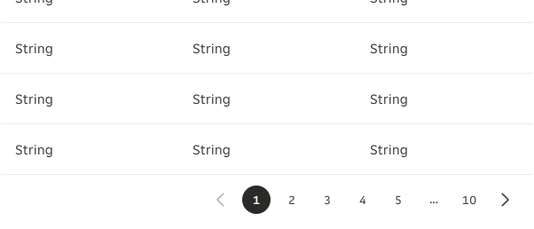
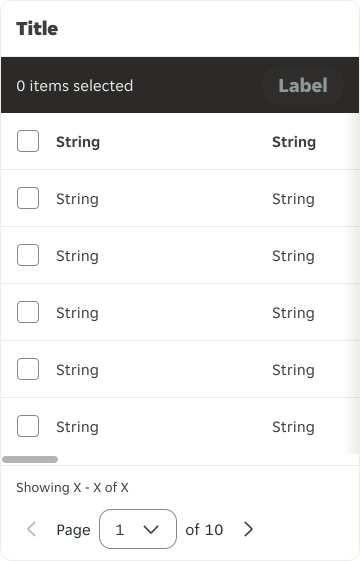
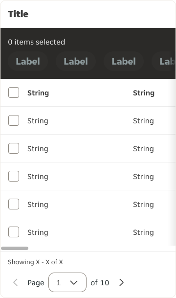
At Narrow the table reduces in width and it is likely that the Data Table's horizontal overflow will be activated. The scrollbar should always be visible. Depending on the quantity of actions within the bulk action toolbar and how long the labels are, actions can be stacked underneath and include a horizontal overflow if needed. The Pagination within the Data Table footer is reduced to only display the Icon Button controls.
Examples
Default
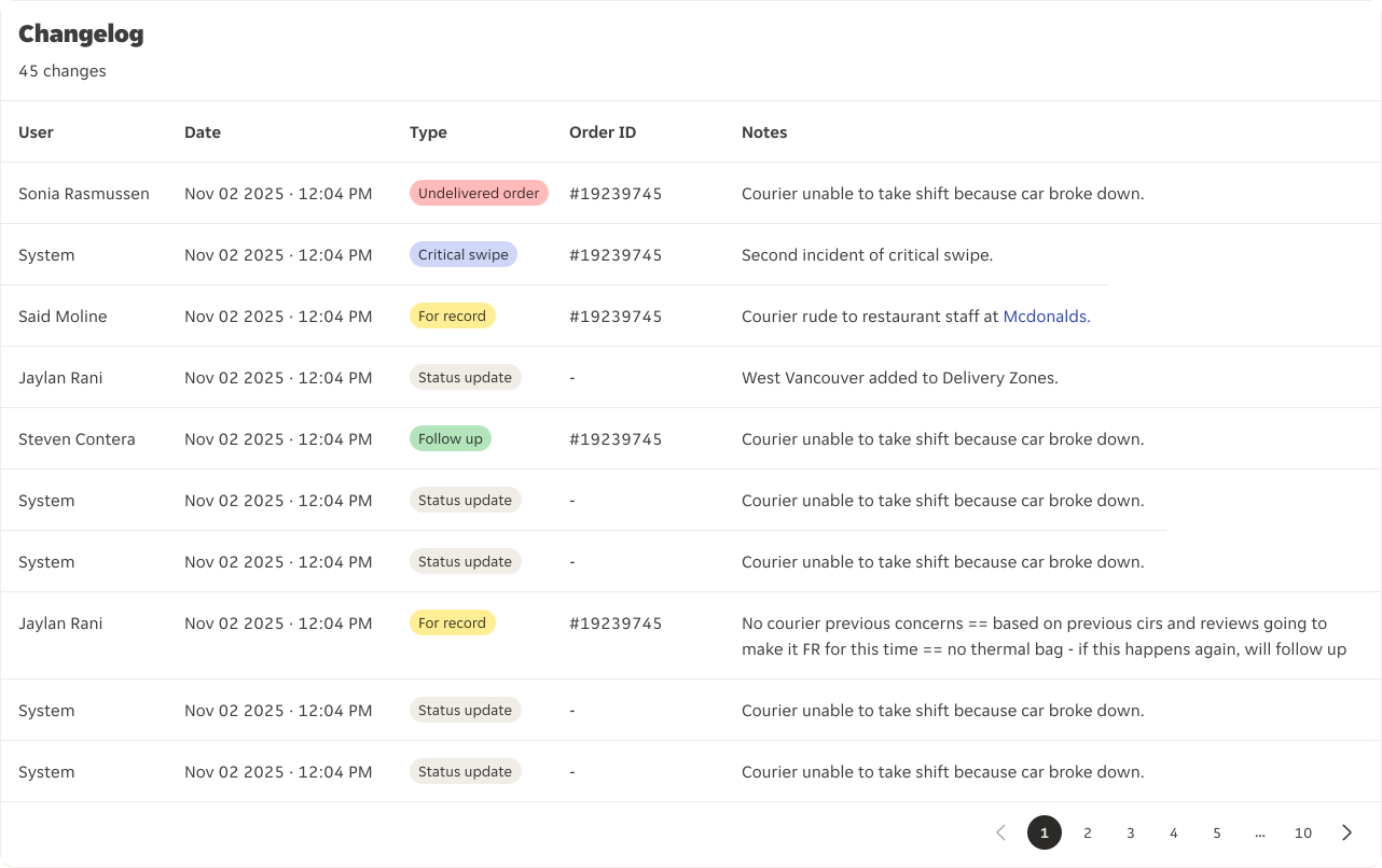
Standard 'read-only' Data Table displaying a mixture of cell types and pagination.
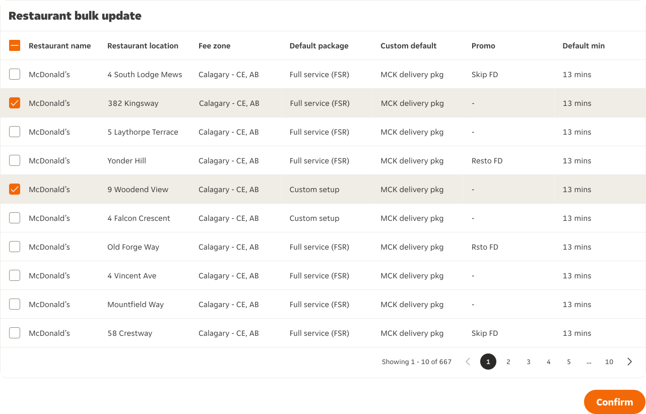
With selection
The action is positioned outside of the Data Table because the user's selections need to be submitted.
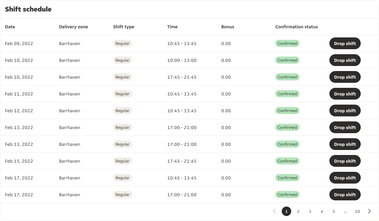
Button
The action is positioned within each row because the action can only be taken one row at a time and cannot be actioned in bulk.
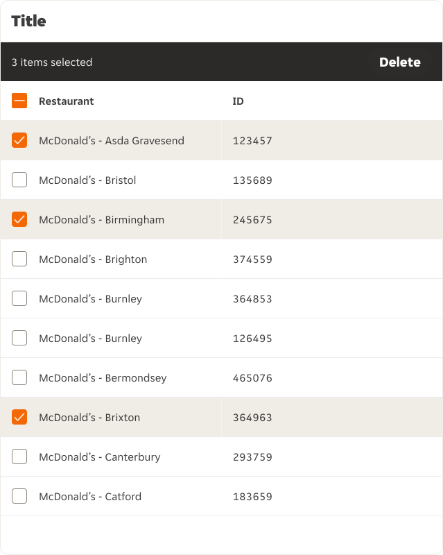
Bulk action with toolbar
The action is positioned within the toolbar because the action can be taken in bulk if required, allowing the user to take action against one or more row items at once.
RTL Examples
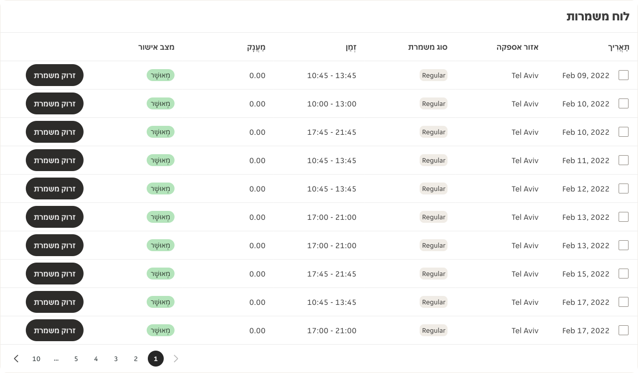
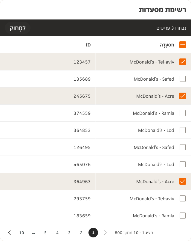
Here are some examples of Data Table in RTL context.