Carousel Indicator

Carousel indicators allow users to navigate through a set of items within a carousel.

Dos and Don'ts

Do
  • Place the Carousel Indicator below the tallest element within the row.
  • Always position the Carousel Indicator in centre alignment only.
Don't
  • Don't use the Carousel Indicator on its own without the context of a Carousel.


Anatomy
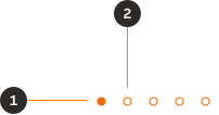
A carousel indicator with two numbered callouts identifying the selected indicator and the unselected indicator.
  1. Selected indicator: Highlights which slide is currently in view.
  2. Indicator: Indicates how many slides there are in total.

Variants

Default

A carousel indicator in the default variant, showing a row of small circular dots.

Primary

A carousel indicator in the primary variant, showing a row of small circular dots in the primary brand colour.

Modifiers

Selected

A carousel indicator showing the selected modifier, with one dot filled to indicate the active slide.

Unselected

A carousel indicator showing the unselected modifier, with all dots unfilled.

Layout

Alignment

The Carousel Indicator should always be centre aligned underneath the 'view' container.

A carousel with a row of indicator dots centred horizontally beneath the slide content.

Behaviour

The quantity of indicators should be equal to the number of slides. All items within the slide transition together when navigating. For example, when there are three items in a carousel, the initial two items move off screen so the following item come into view. The number of items shown can be adjusted per breakpoint to show more/less depending on available space.


A carousel at the start position with the first indicator dot selected.
A carousel at the end position with the last indicator dot selected.

Interactive states

Default

A carousel indicator in its default state with no interaction applied.

Hover

A carousel indicator with one dot in its hover state.

Active

A carousel indicator with one dot in its active (pressed) state.

Focus

A carousel indicator with one dot showing a visible focus ring.

Examples

LTR example

Here are some examples of a Carousel indicator in LTR context.

A carousel indicator displayed in a left-to-right layout context.

RTL example

Here are some examples of a Carousel indicator in RTL context.
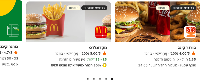
A carousel indicator displayed in a right-to-left layout context.
Back to top